
Quick Glossary Terms
There are a few system terms used on this page that I want to provide clarification for below. Please refer back or be aware of these as needed while viewing this documentation. To see our full Glossary of terms please click here.
Components – All materials in the system used to create a formula for production is a component (ingredients / packaging / production materials etc.).
Component Type – This is a grouping or category of components (Master Case, Lids, Bottles, Capsules etc.).
Sections – These are user created sections with custom fields within a component type that can display or request information. This glossary term is unique to this pages documentation.
Fields – Fields are used within Sections and provide a variety of functional input options. This glossary term is unique to this pages documentation.
The Component Information function will allow you to create additional information sections (also considered Tabs) to a Component Type that we do not provide by default. These additional sections can be found when editing a component, under the Additional Details area, and will look like another tabbed section. Within these new sections you are able to create multiple fields that can be filled out, require choices, or display information per component for the component type it is created for. A useful example would be adding a field that contains information to be displayed with a component name, giving you the ability to quickly identify and search for components within a grid. We will go over this example and more with this help page documentation.
Upon entering the Component Information page you will be faced with a grid. This grid will be automatically populated by the Virtual Ops system with entries, per the component types used in within your system. These entries can be sorted by clicking the column titles, using the search function or filtering by additional options. For more information on Grid Sorting click here.
Virtual Ops System Location/Navigation:
Administration > Configuration > Component Information
Grid Action Buttons
View Information – Select a row/entry on the grid and then select this action to view or edit the information.
Column Visibility – By selecting this option you can change the visible columns per the grid you are on. These selections are saved per user/browser per grid.
Excel – Selecting this action will export the currently displayed grid data to excel.
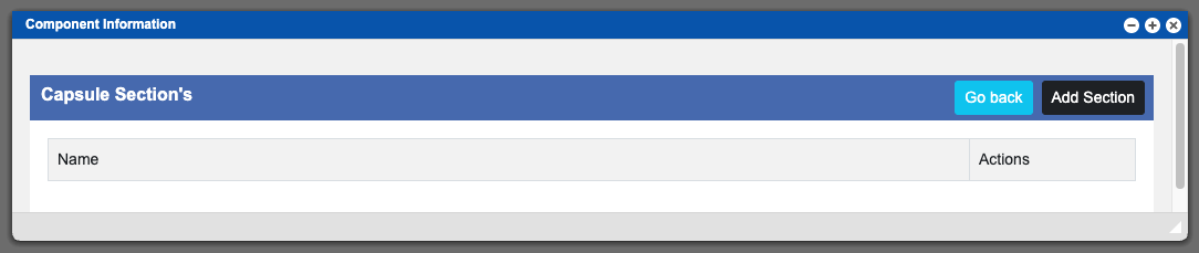
For the example process below I am going to use the Capsule component type. After navigating to the Component Information section in Virtual Ops, I will then select Capsules from the top row of the grid (refer to image at the top of this page) and then click the View Information action button. Another window will open and you will need to click the black “Add Section” button to begin this process – see example below – click to enlarge.
You will want to start with entering a title for your newly created section. This can be done with the Section Label input located above the Fields area. The section label will be the name displayed as the section/tab title when viewing a component. From this point you can now begin to create Fields for this section. The first field is ready after creating a new section and you can add more fields to a section by clicking the black “Add Field” button at the far right of the Fields title bar. See example image below – click to enlarge. I will list out the Fields input areas and their functions with descriptions below.
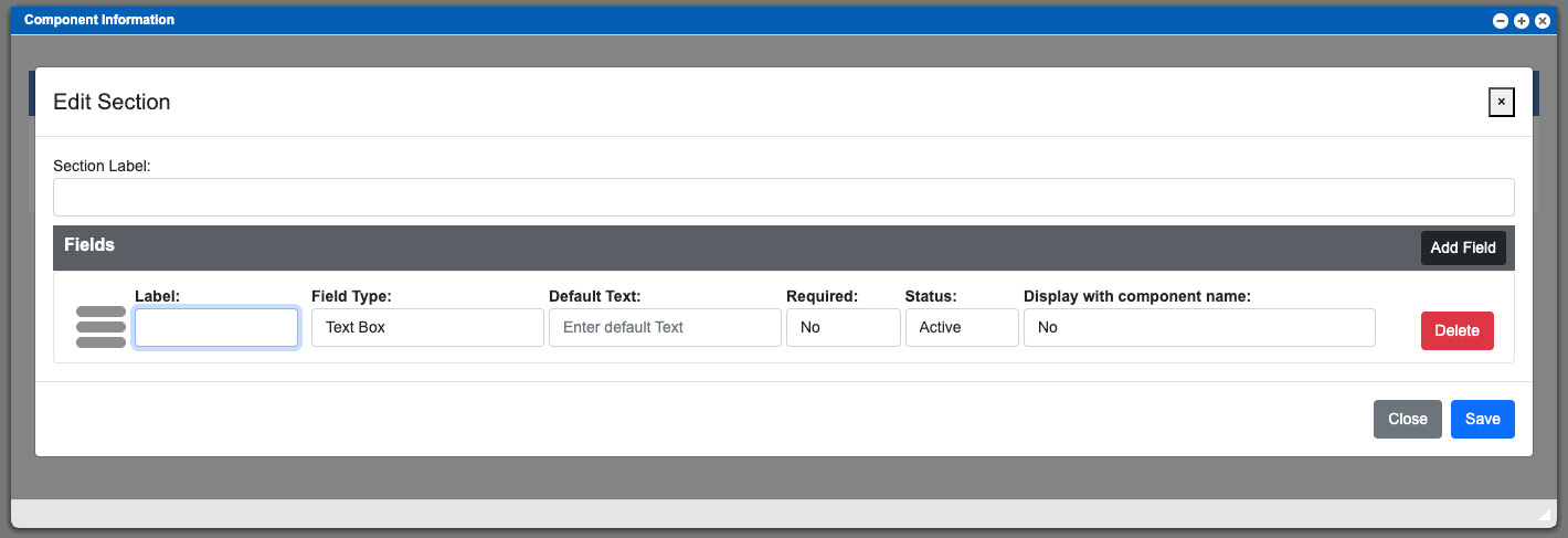
Section Label:
The section label will also be used as the title for new section (tab) within the component. The section label, as a suggestion, can be named per the additional contents that it will contain. This new section/tab will be displayed in the Additional Details area while editing a component.
Label:
This input will be the title for a new field that you are creating under a section.
Field Type:
This input will allow you to change the functionality of the input box for the field and will directly affect the next inputs (Default Text/Options) purpose. The currently available functions for field types are: Drop down, Label, Multiline Text Box and Text Box.
• The Text Box and Multiline Text Box functions will allow you to provide a global (for the particular component type) text input box. Leaving this input blank, while creating the field for the section, will allow it to be individually and uniquely entered for each component (of that component type).
• The Drop Down function will allow you to create multiple text options, separated by a comma, that can be selected uniquely per component.
• The Label function is much like the Text Box function but provides a way to globally set a text statement for an entire component type. This input is non-editable while editing or viewing the component(s). This function cannot be used with the Display with Component name function.
Default Text/Options:
This input is dynamic and will change depending on the Field Type function selection. Input information or selections for requests within a component.
Required:
This a yes or no section box that will determine if the Default Text/Options input is a required field when editing and saving a component.
Status:
Setting this input to in-active will deactivate the field across the entire component type.
Display with Component name:
This function can be used in conjunction with the Text Box function and will display the entered content from the Default Text input into the components name. This is commonly used and can be helpful to delineate specific components to be more easily found while searching within a grid.
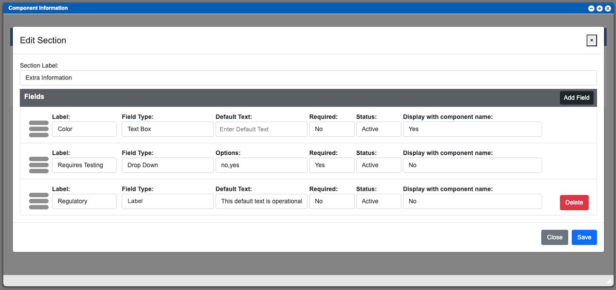
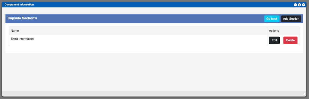
I have created an example section and used several of the functions. See example image above – click to enlarge. Once you have created your fields, click the “Save” button at the bottom of the window to save the section. After saving you will now see the created section, which I named “Extra Information”, within the Capsule component type. At this point you can create another section and add fields, edit an existing section, or delete an existing section. See example image below – click to enlarge.
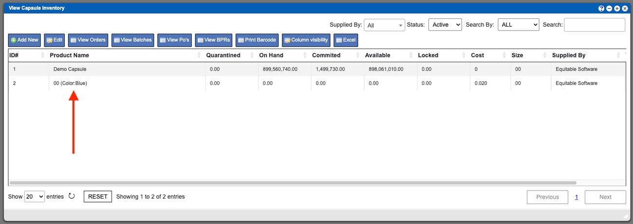
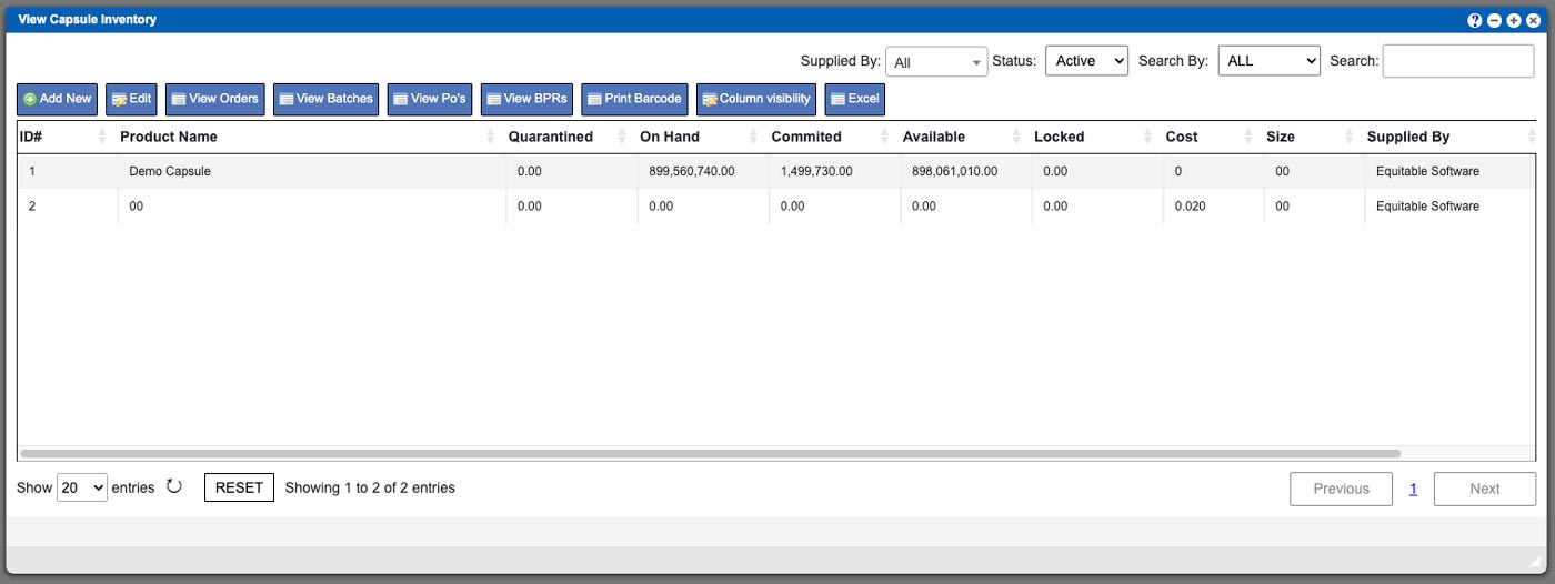
For this example I created a Section to be used within the Capsule component type. I am going to pull up this component (Inventory > Add/Edit Packaging > Capsules). In the example image below, you can see we have two capsule components currently in the system. BOTH of these components will contain the section (and its accompanying fields). I am going to click to select the “00” and then click the Edit action button at the top of the grid.
Now that I have the 00 capsule component screen open you can see the newly created Section “Extra Information” in the bottom portion of the window in the Additional Details area. It resembles another tabbed Section like the other currently present sections (Files and Vendor Pricing). In the example below I have clicked the Extra Information section to view the contents. See example image below- click to enlarge.
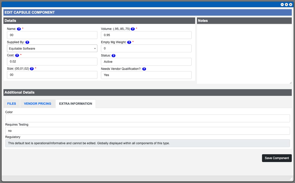
We can see the three fields that we set up earlier for this component types “Extra Information” section. Color is a text box function that will display its input with the component title. Since we left the Default Text input blank while creating the field earlier, it allow for unique naming to be created per component. The Requires Testing drop down function can be clicked to select from the available options – notice that it displays the first option that we input into the options field during creation. And finally, the Regulatory field uses a Label field. This is a non-editable input (from the component) and will display the content that was input into the Label Text input. This will be displayed in all of the Capsule components types.
While editing this 00 capsule component, I am going to enter in “Blue” for the color and save the component. I will then close the component window and click the grid refresh button (bottom of grid) to see the changes. You can now see that the color field text input is now being displayed with the components title in the grid. See example image below – click to enlarge.